

Celebrating 15 years of Assassin's Creed
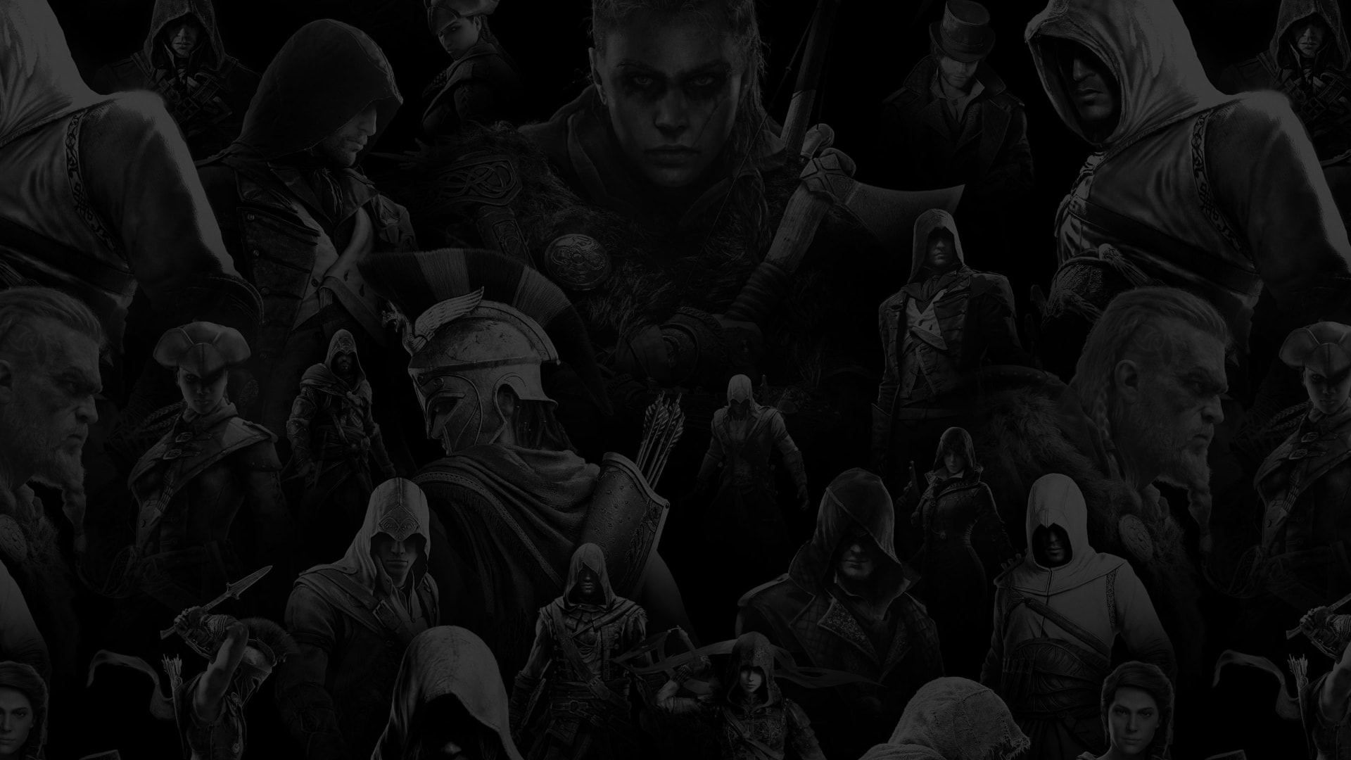
Assassin's Creed had fifteen years of characters, worlds and stories behind it, with an anniversary that needed to do more than look backward. The celebration would bring together game announcements, partnerships, community activity and brand communications while helping set the stage for the future of the franchise.
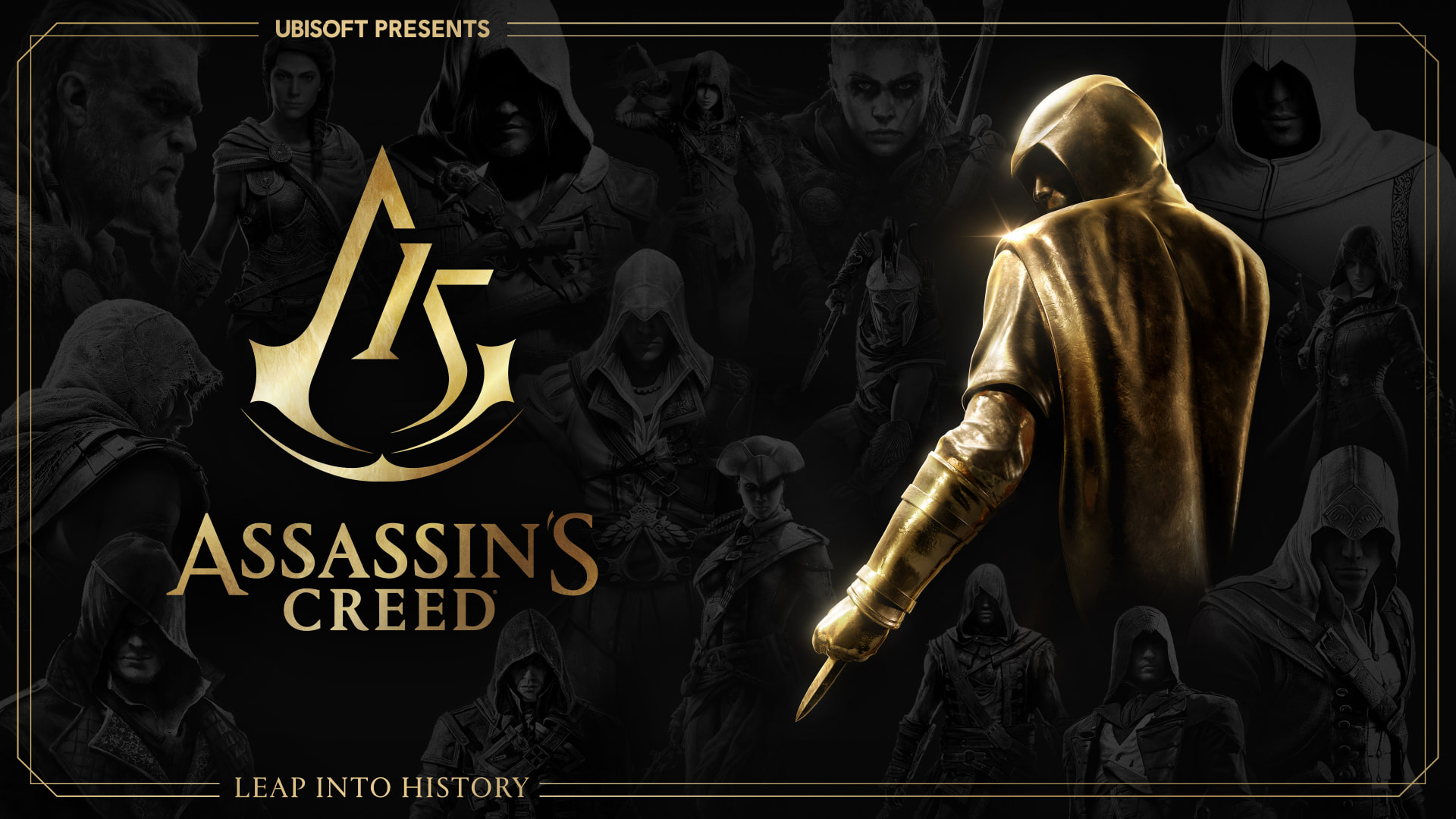
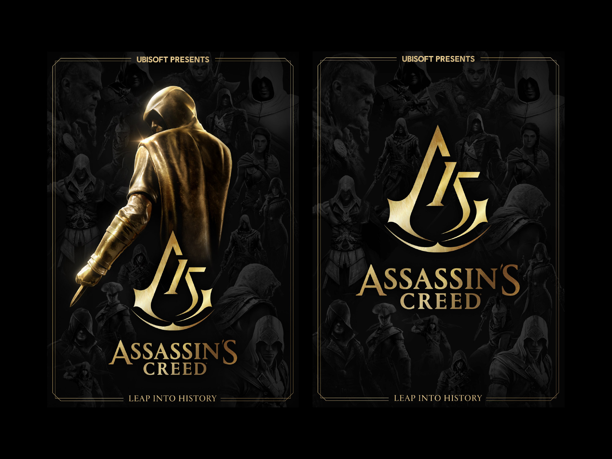
Working with the global brand team, we developed a commemorative visual language and flexible event toolkit that could bring those different moments together. Built around the anniversary key art, gold typography, graphic framing, atmospheric textures and the history of Assassin's Creed, the system gave teams and agency partners a recognizable foundation they could extend across channels, formats and markets.
Art Direction, Design
Jeanna LeClair
Global Brand Management
Helix Studio
UCS Project Management
Anniversary Key Art, Visual Identity, Event Toolkit, Social Assets, Motion Graphics
Fifteen years. One visual language.
The anniversary was conceived as a celebration of the entire Assassin's Creed franchise rather than a single title or hero. The creative direction needed to represent the breadth of the franchise while creating a platform for announcements, partnerships and community activity.
That created an interesting design challenge. The system needed enough character to make the anniversary immediately recognizable, but enough flexibility to coexist with fifteen years of existing worlds, characters and imagery.
Built to connect the celebration.
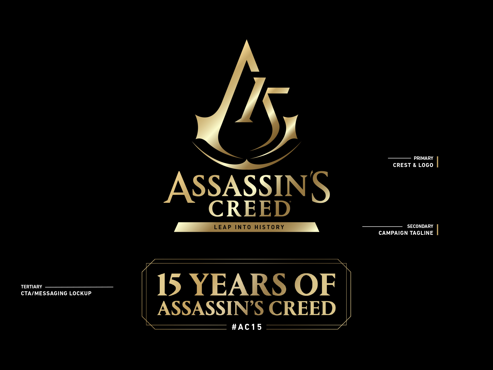
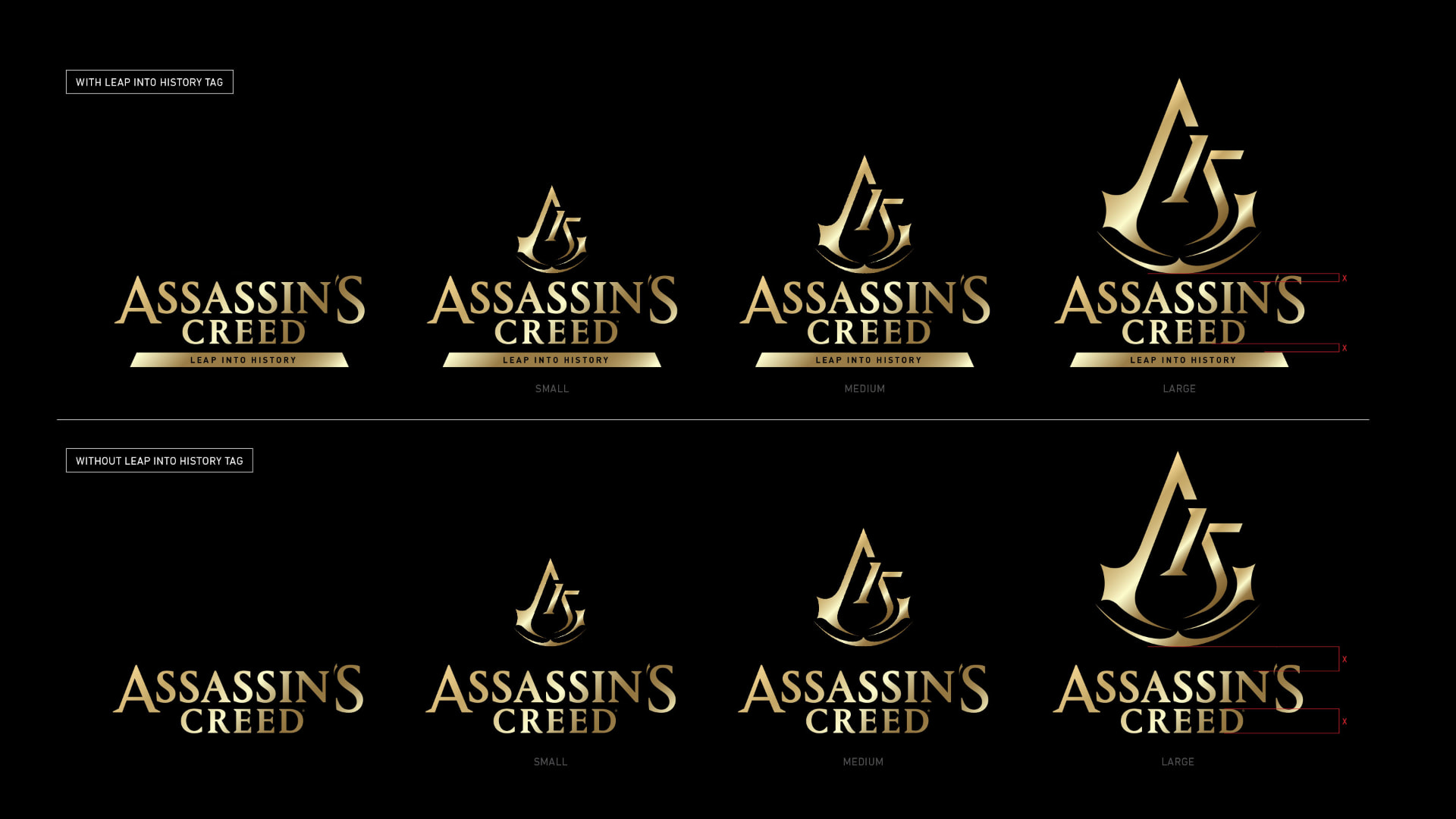
Rather than treating each touchpoint as a separate piece of creative, we developed a modular graphic language that could identify AC15 wherever it appeared.
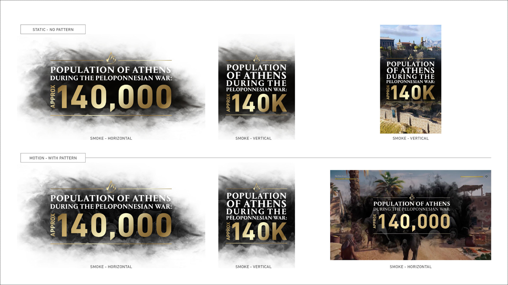
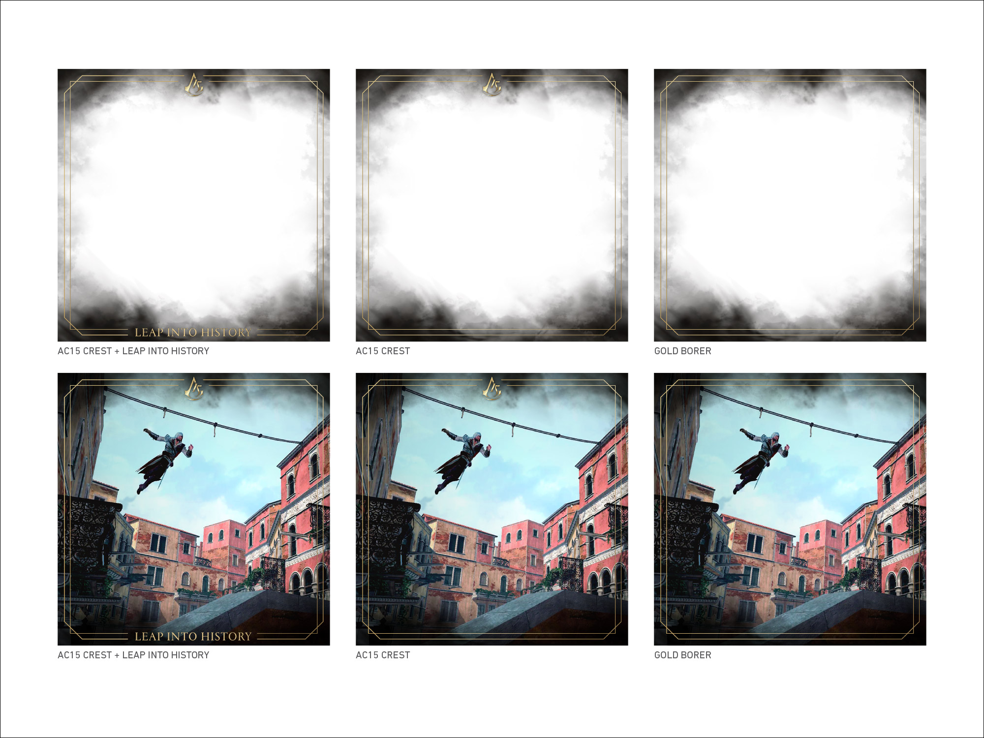
Gold became a key connective device, supported by branded borders, anniversary stamps, typography, banners, lower thirds and atmospheric textures. These elements could frame existing franchise imagery without overwhelming it, creating consistency while allowing individual games and stories to retain their own character.
A toolkit, not a collection of assets.
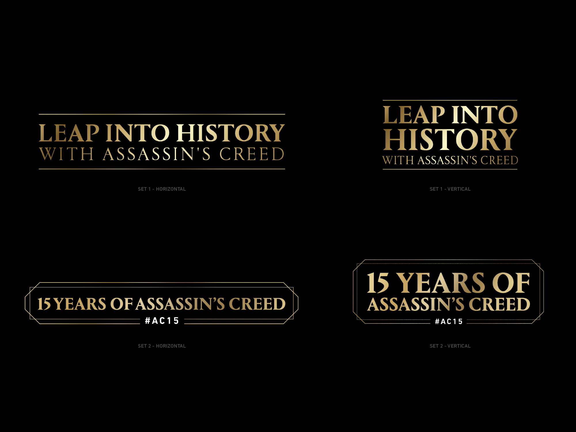
The system needed to work beyond the core creative team. The event toolkit was designed as an extended style guide that could give internal production teams and external partners a shared foundation for creating AC15 communications.
That meant establishing enough structure for the identity to remain recognizable while giving teams room to adapt it to different content. Templates were designed across multiple formats, helping the system move between video, social, digital and campaign communications without reinventing the visual language each time.
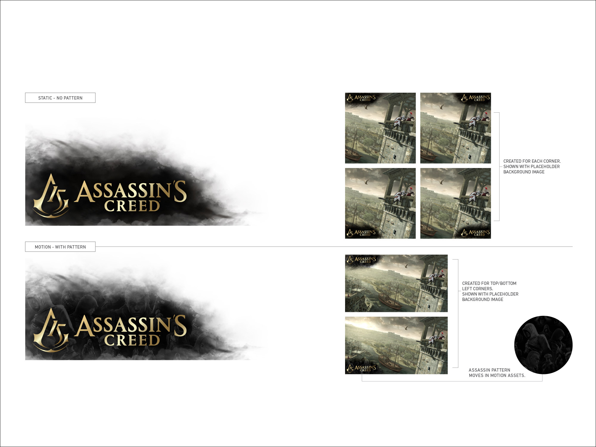
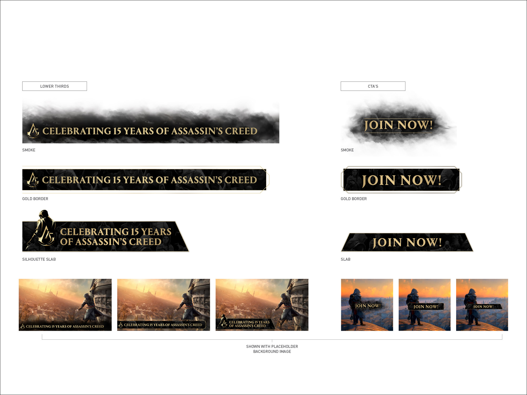
A system for celebrating the past and carrying the brand forward.
AC15 created a shared visual language for a franchise-wide anniversary rather than a single campaign execution. The system connected fifteen years of Assassin's Creed across brand, social, motion and digital touchpoints while giving internal teams and external partners a practical framework for continuing the celebration.
It was a project where art direction and systems thinking needed to work together. The identity had to feel commemorative and distinctive, but its real value came from creating enough clarity and flexibility for many different teams to build from it without losing the idea.
One campaign across twelve weeks.
The social campaign extended across twelve weeks, requiring a system that could accommodate a significant amount of changing content while still feeling unmistakably part of AC15.
Reusable borders, logo stamps, animated lower thirds and infographic templates created a consistent framework for everyday content, while end cards, digital activations and campaign roadmap assets extended the language into more specific moments.