

REIMAGINING JUST DANCE FOR A NEW ERA OF PLAY.
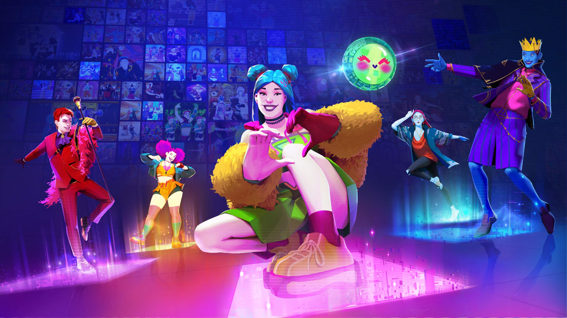
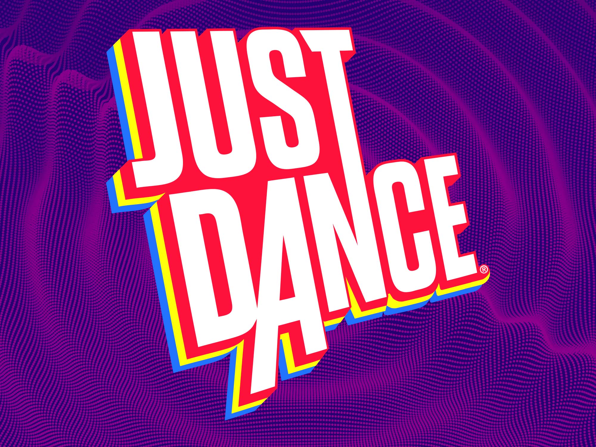
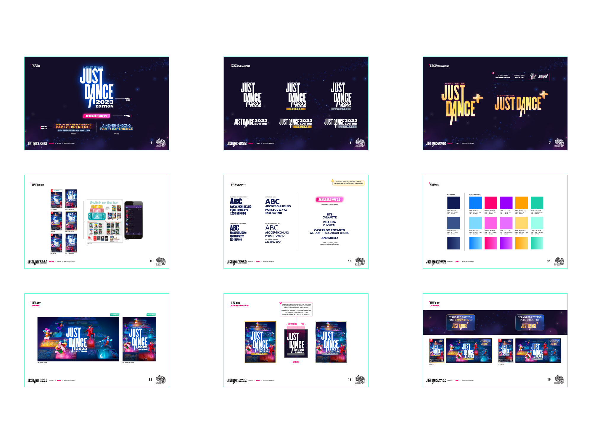
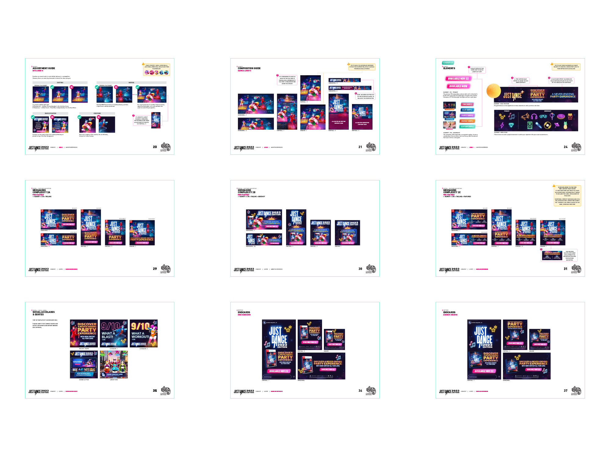
Led my design team through a global brand refresh as Just Dance evolved toward a live-service platform, creating a new visual identity, key art, packaging, and scalable marketing toolkit for global markets.
Art Director
Ubisoft Global Publishing
Julia Di Marco
Jeanna LeClair
Global Brand
Paris Production Studio
UCS Project Management
Wideout Production Artists
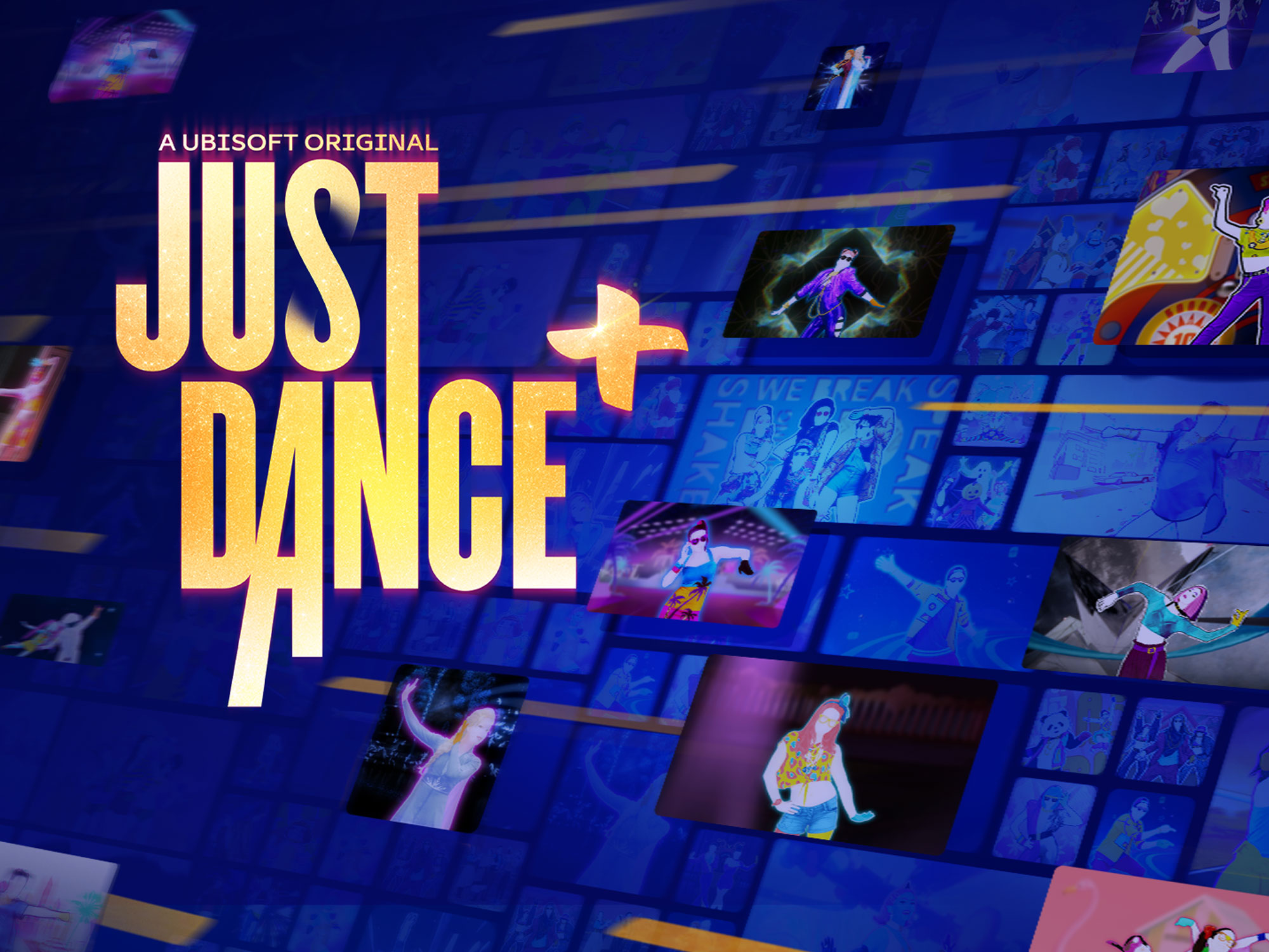
Visual Identity, Franchise Logo, Key Art, Splash Art, Pack Art, Character Direction, Global Brand Marketing Toolkit
A global brand moving toward live service.
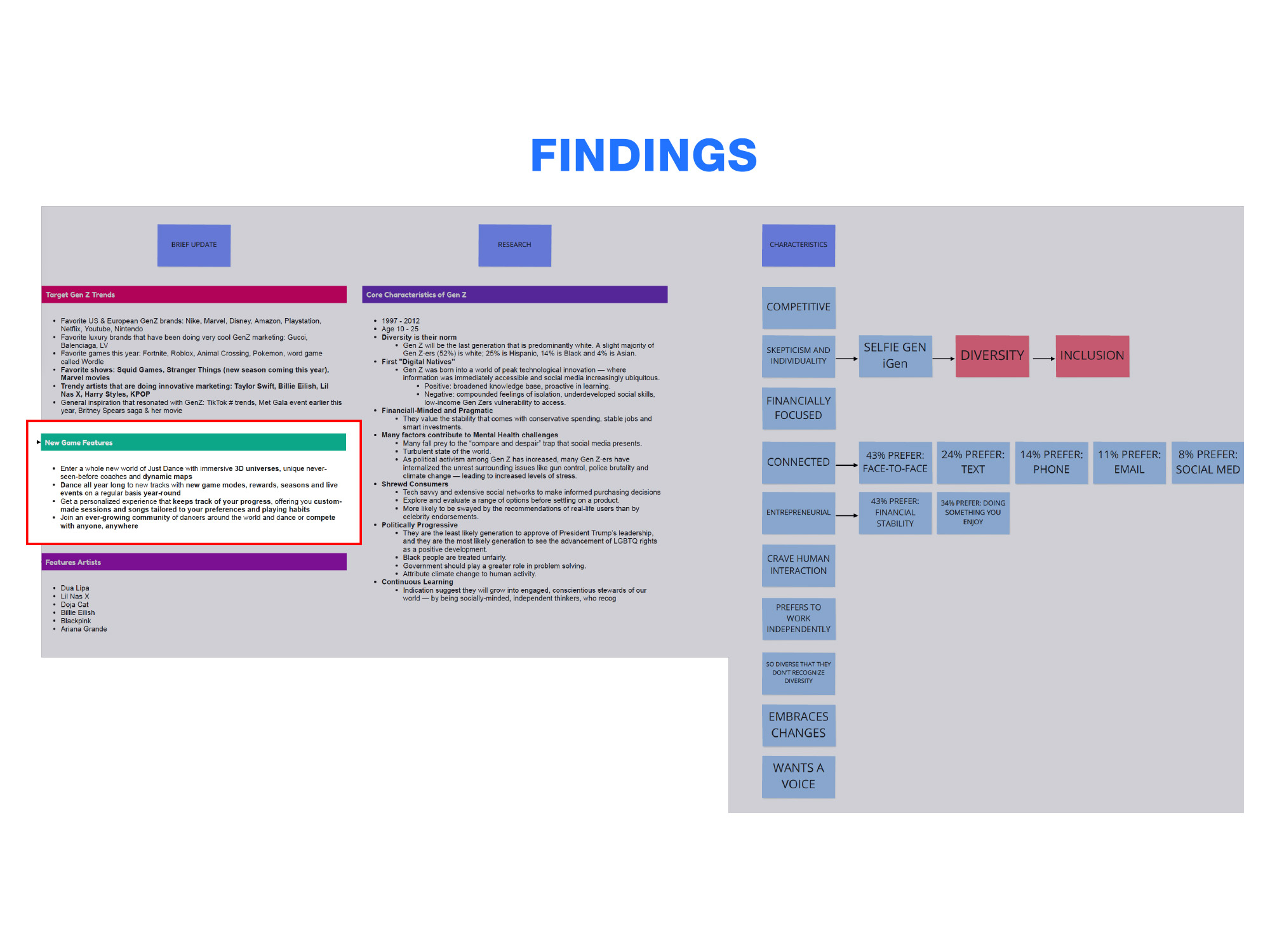
Just Dance is a global entertainment brand that lives across markets, languages, platforms, retail, and social. As the franchise began transitioning from annual releases toward an ongoing live-service platform, the brand needed to evolve with the product rather than simply refresh itself each year.
The brief changed while the work was underway.
What began as a visual refresh grew once a tissue session surfaced important information about the platform transition. The identity had accumulated years of expression that varied between regions and touchpoints, and the product itself was becoming something different. The refresh had to account for a bigger story than the original brief described.
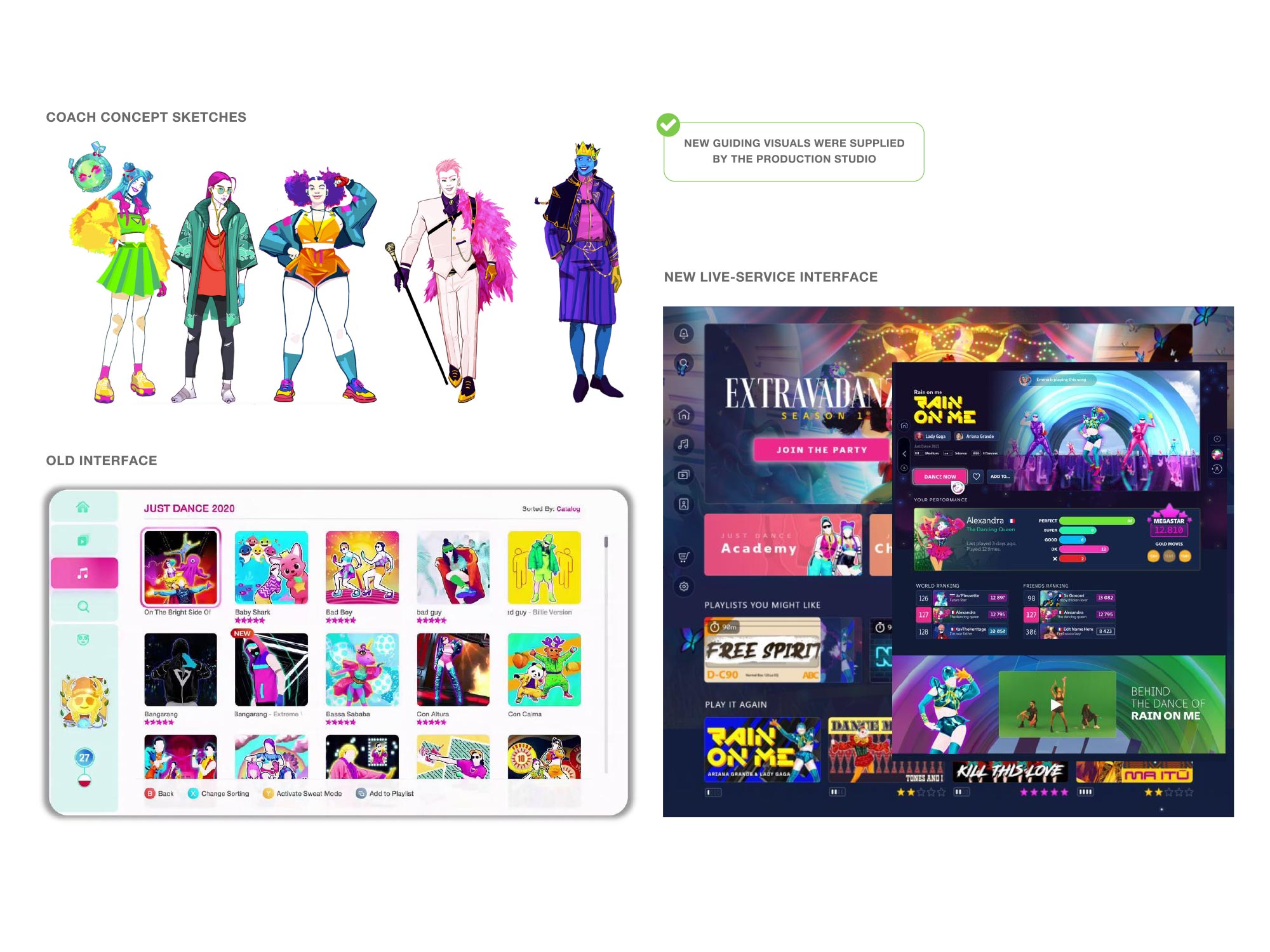
The interface became part of the brand.
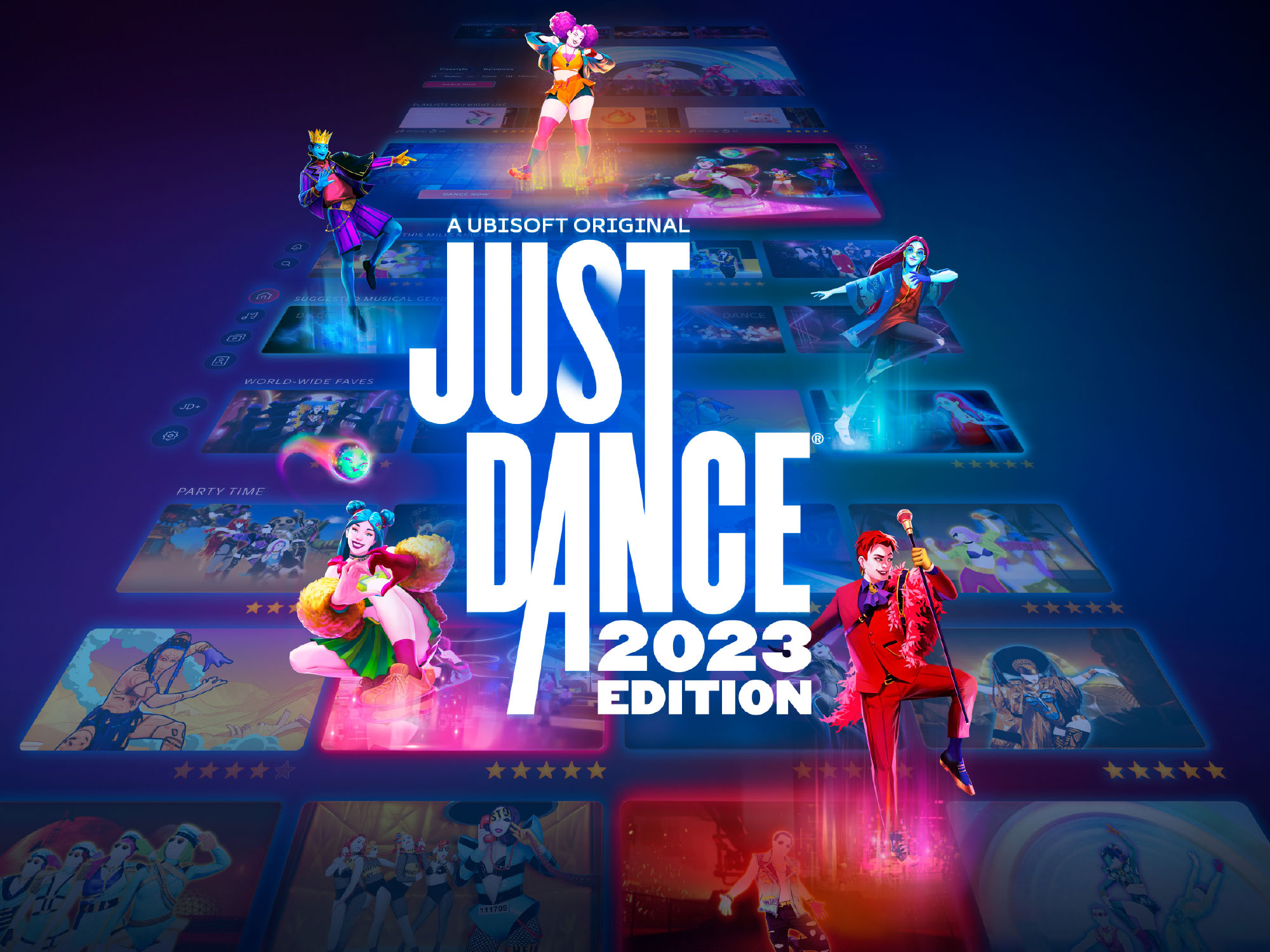
If Just Dance was becoming a platform, the experience of browsing, choosing, and returning was as much a part of the brand as the coaches. Making the interface visible in the creative let the identity communicate breadth and ongoing content while keeping the recognizable Just Dance energy intact.
Keep the energy. Mature the expression.
The direction was to become more sophisticated without becoming serious: show a world rather than a cast, make the platform visible, and design for evolution so the identity could absorb new songs, seasons, content, and markets. Where several viable directions existed, we tested rather than defended them.
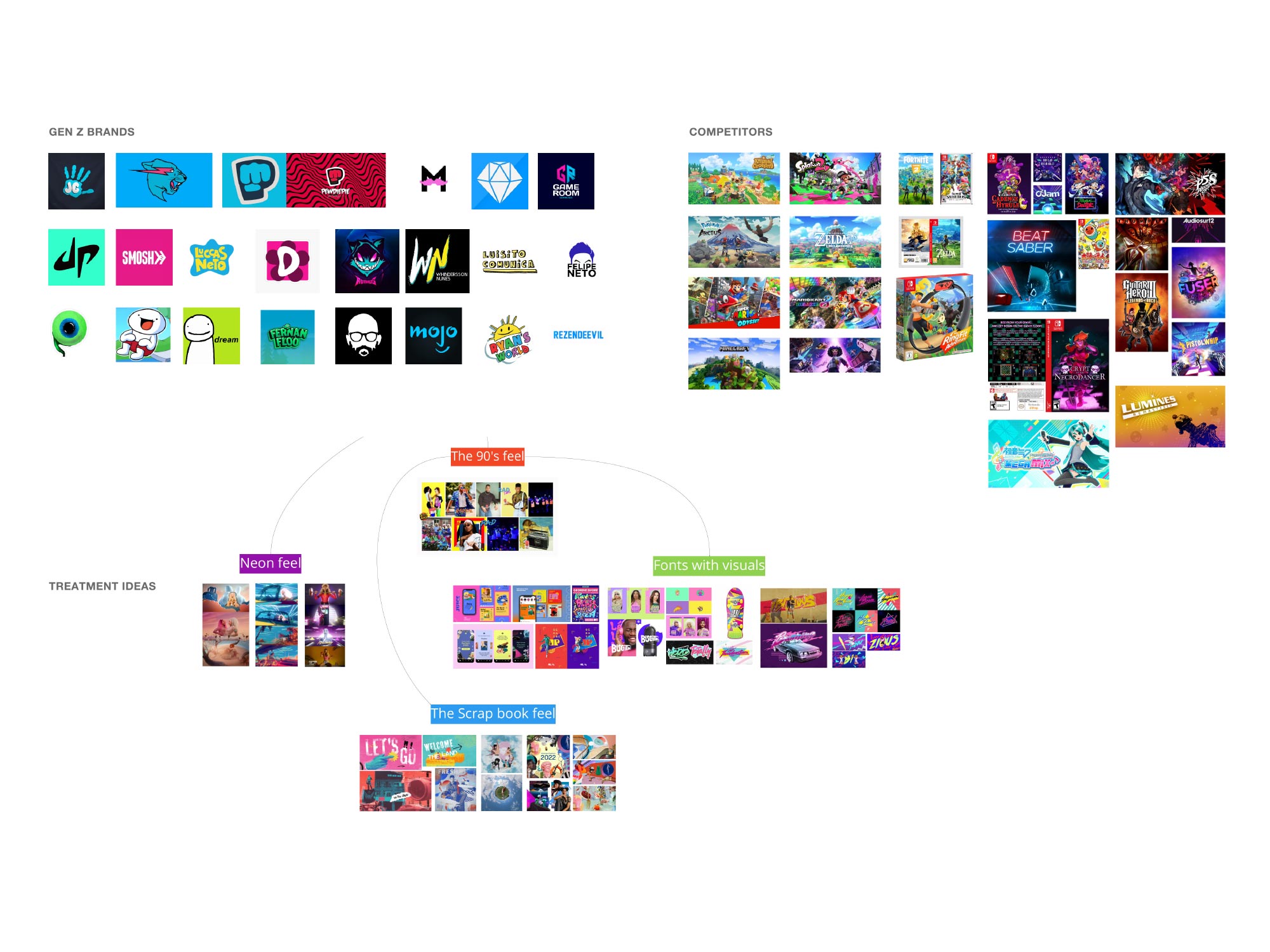
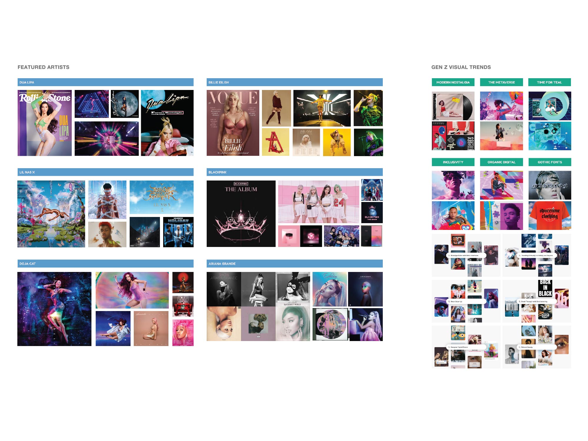
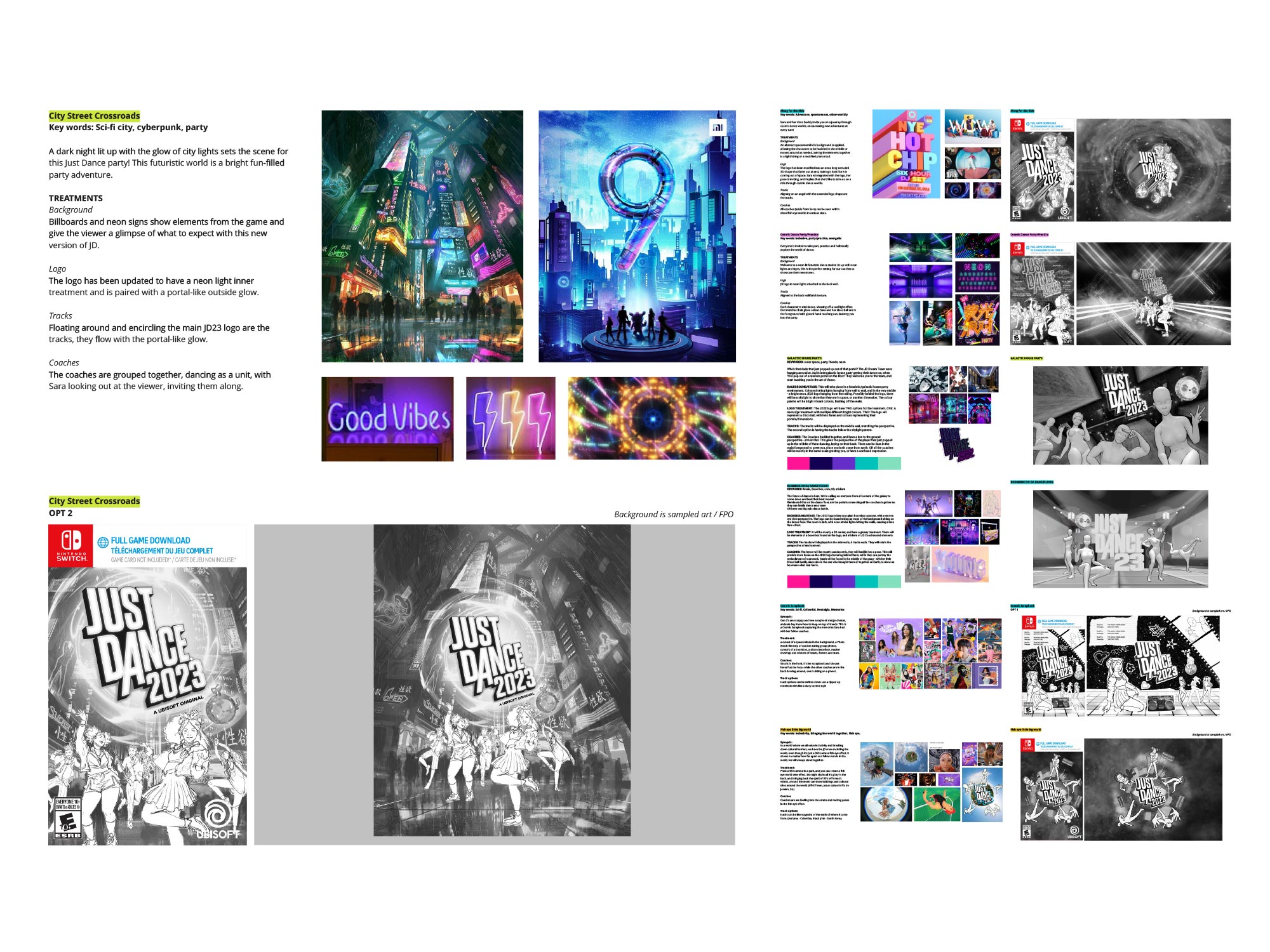
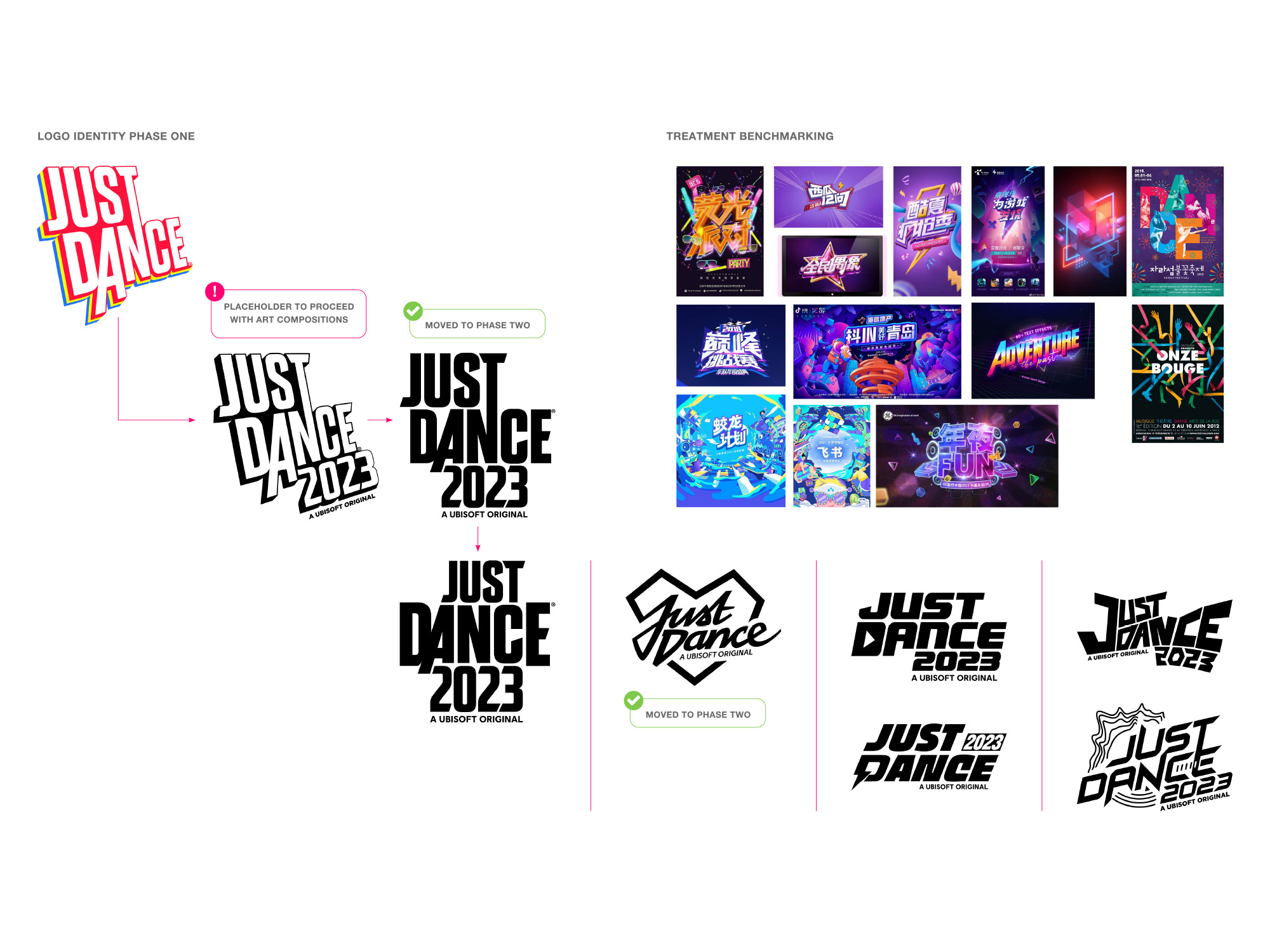
Identity, key art, packaging, and coaches.
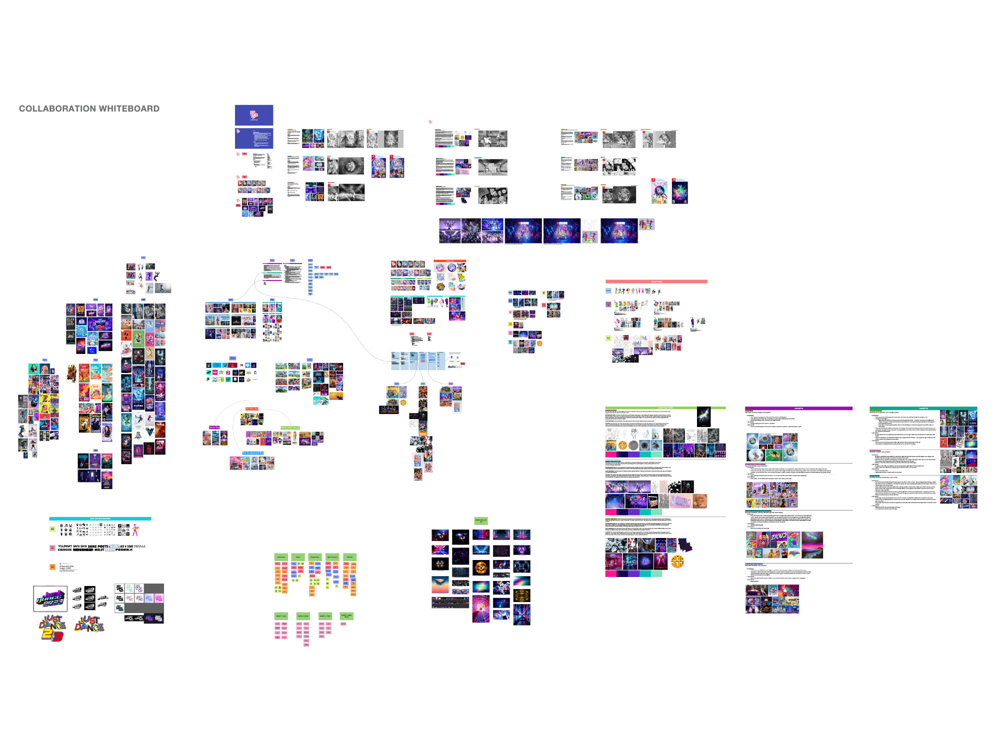
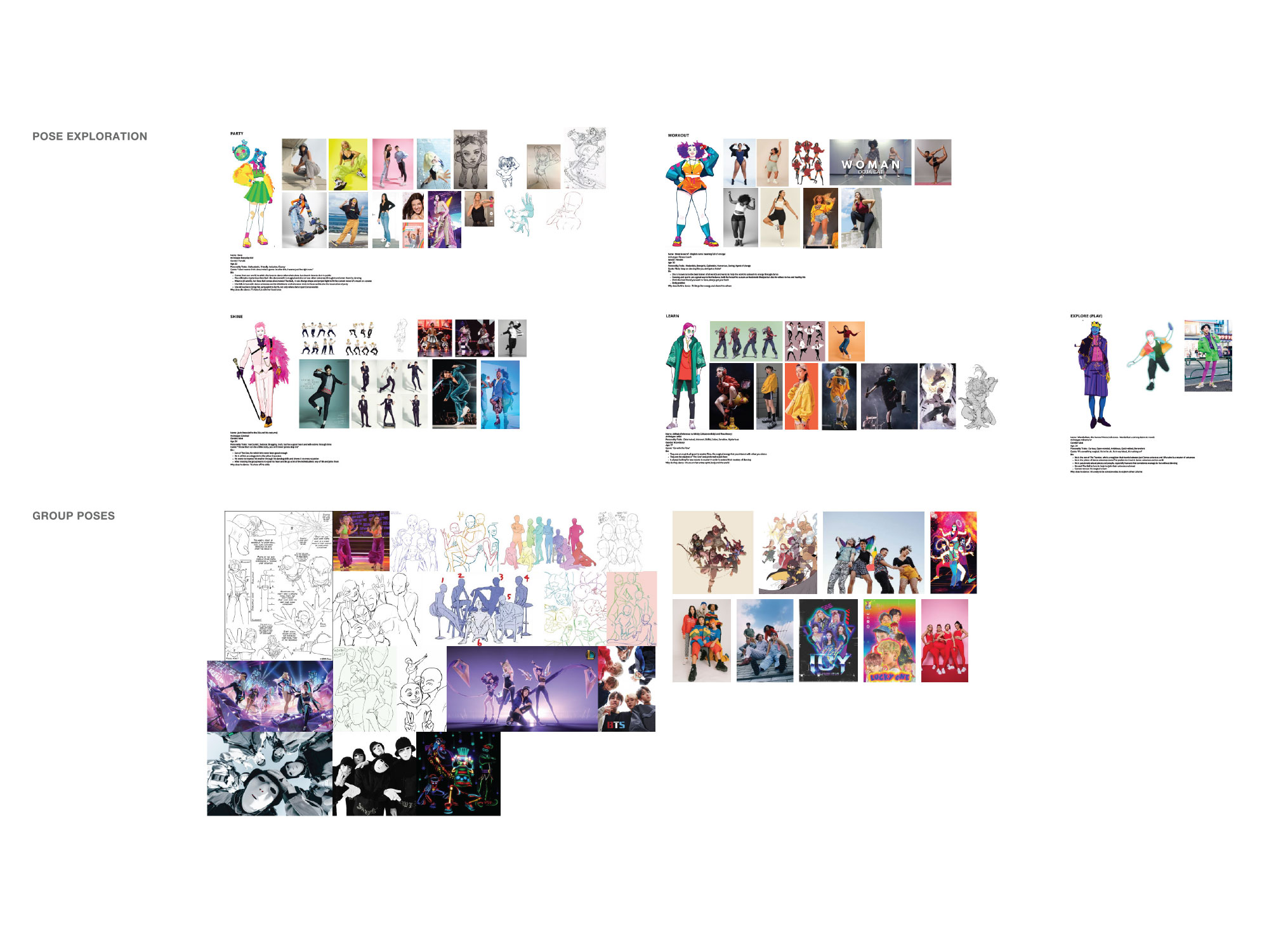
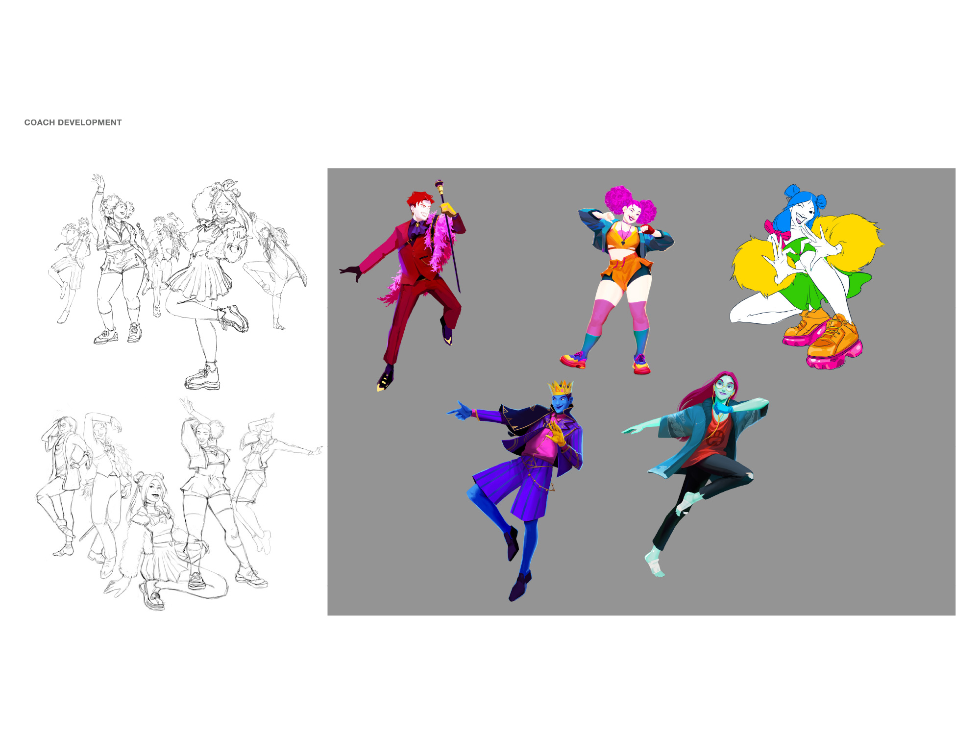
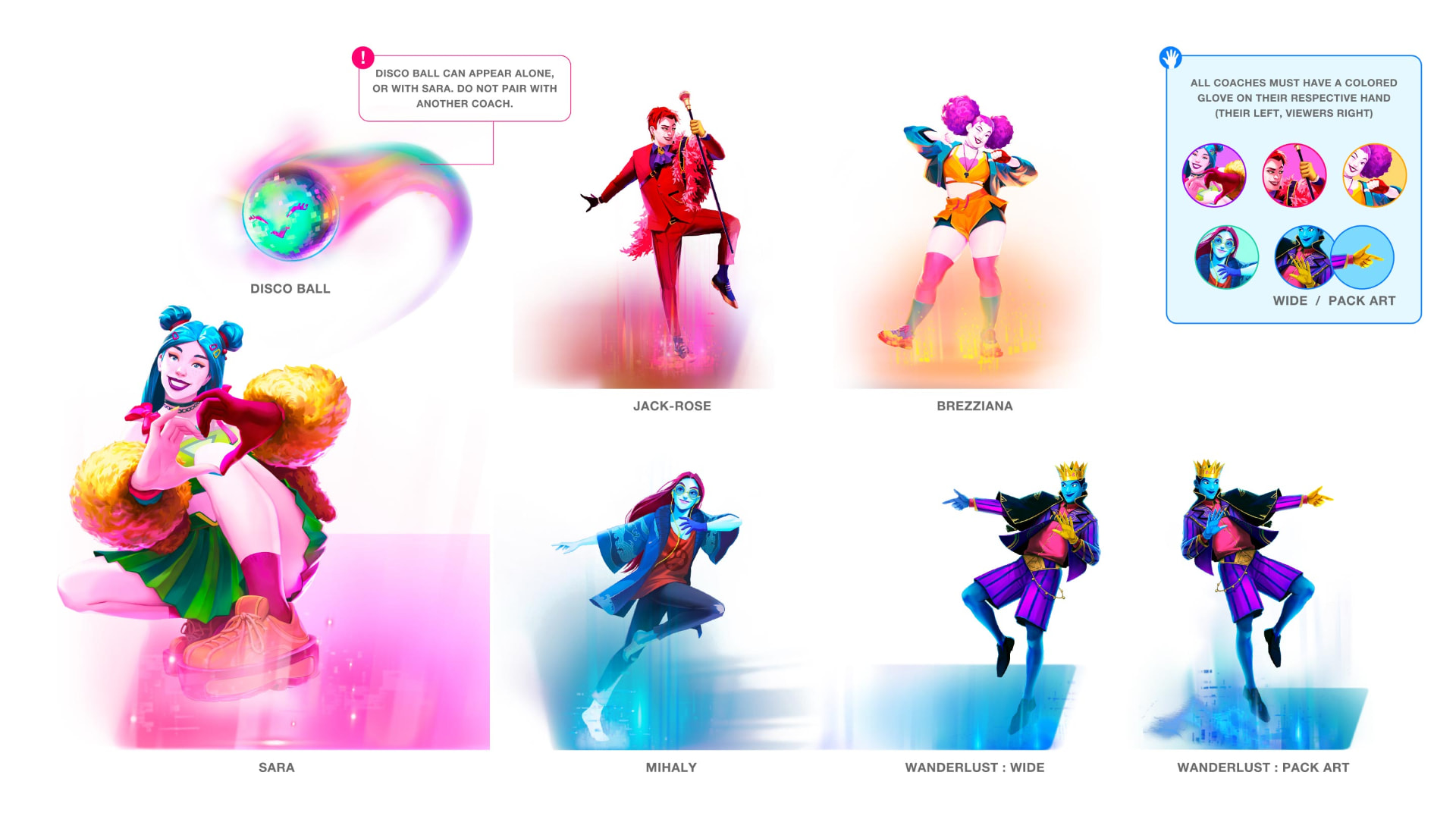
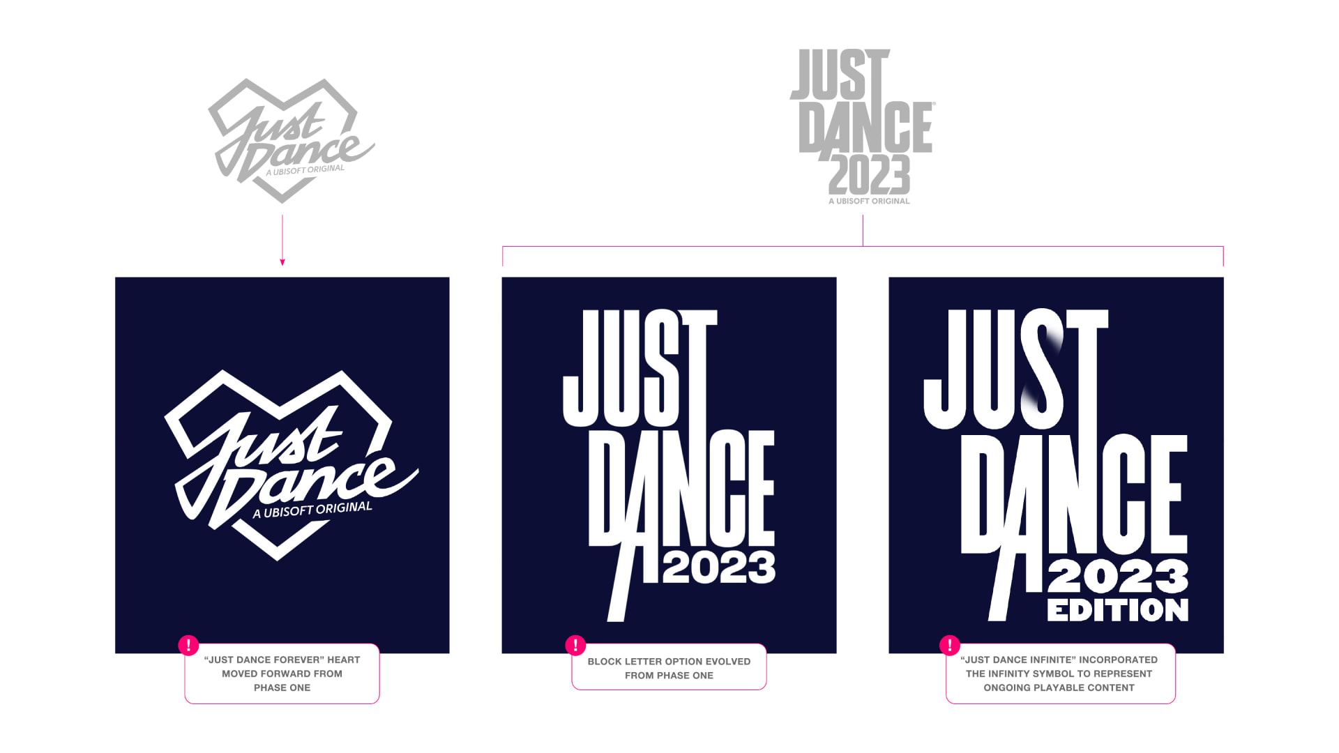
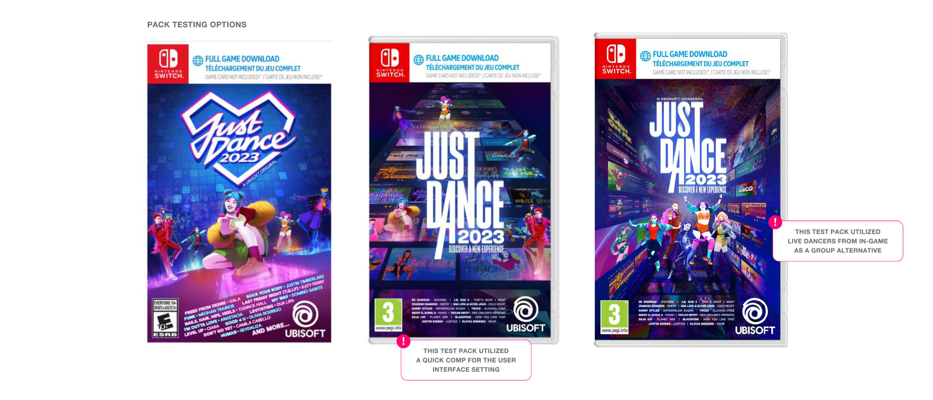
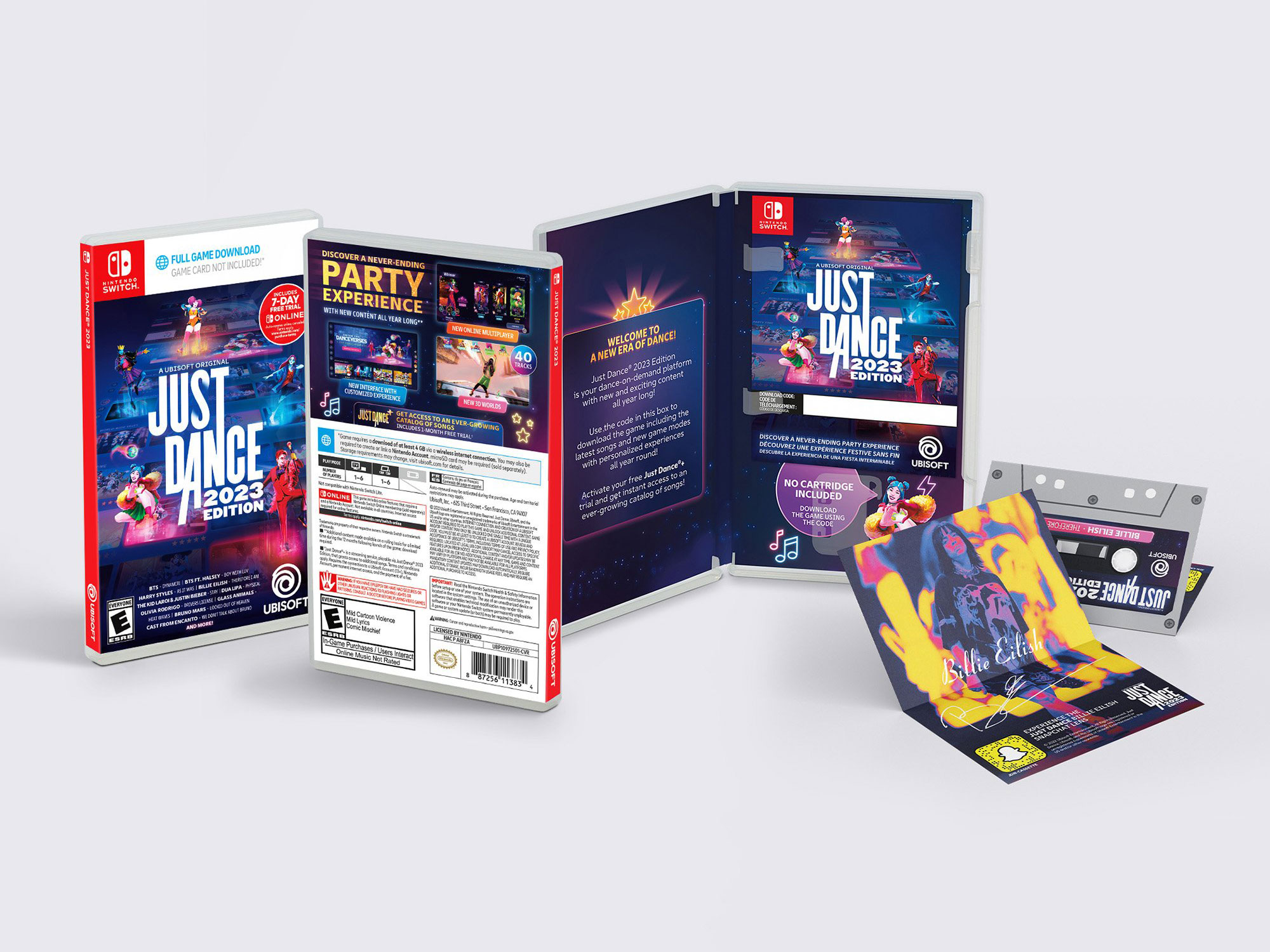
My team explored the franchise logo through multiple phases, greyboxed compositions, researched and benchmarked the category, and developed coach posing and character expression alongside new key art, splash art, and pack art. Multiple directions were built out to a testable standard, then A/B tested with audiences before selection.
A connector between Global Brand and the studio.
Much of the work was alignment. I acted as a connector between Global Brand and the Production Studio, translating intent in both directions, keeping decisions written down and visible, and adjusting resourcing with freelance creative partners and production artists to protect both quality and timing as the scope grew.
A refreshed brand, delivered on schedule.
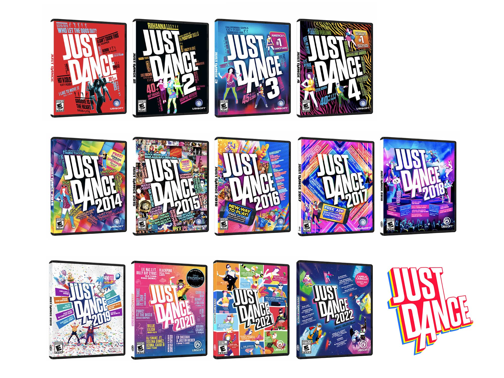
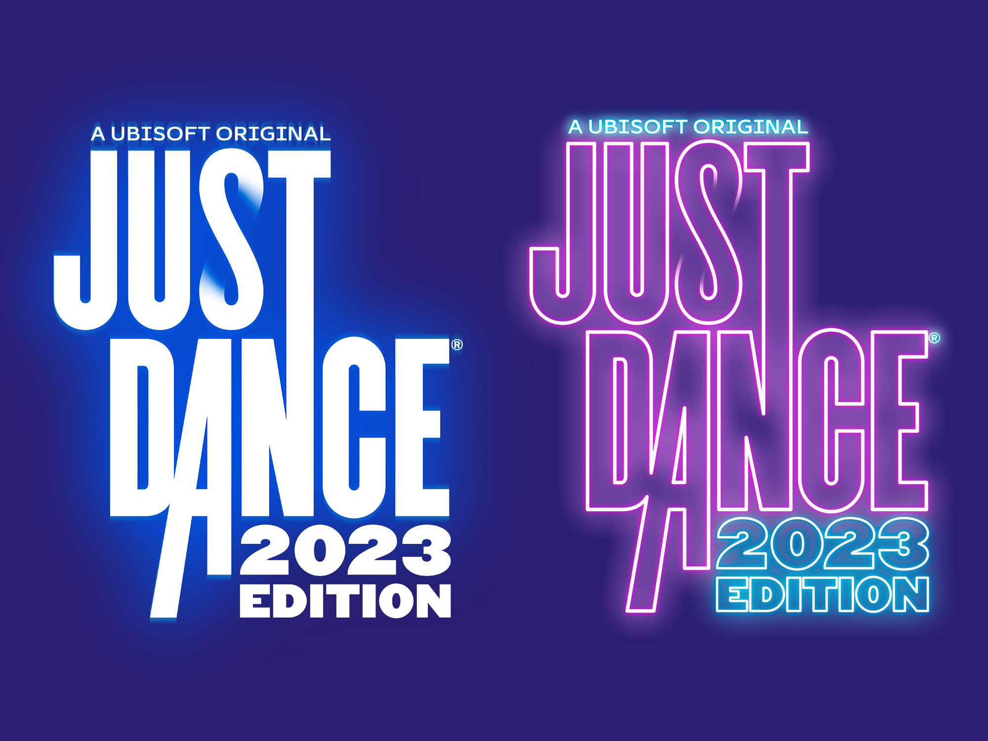
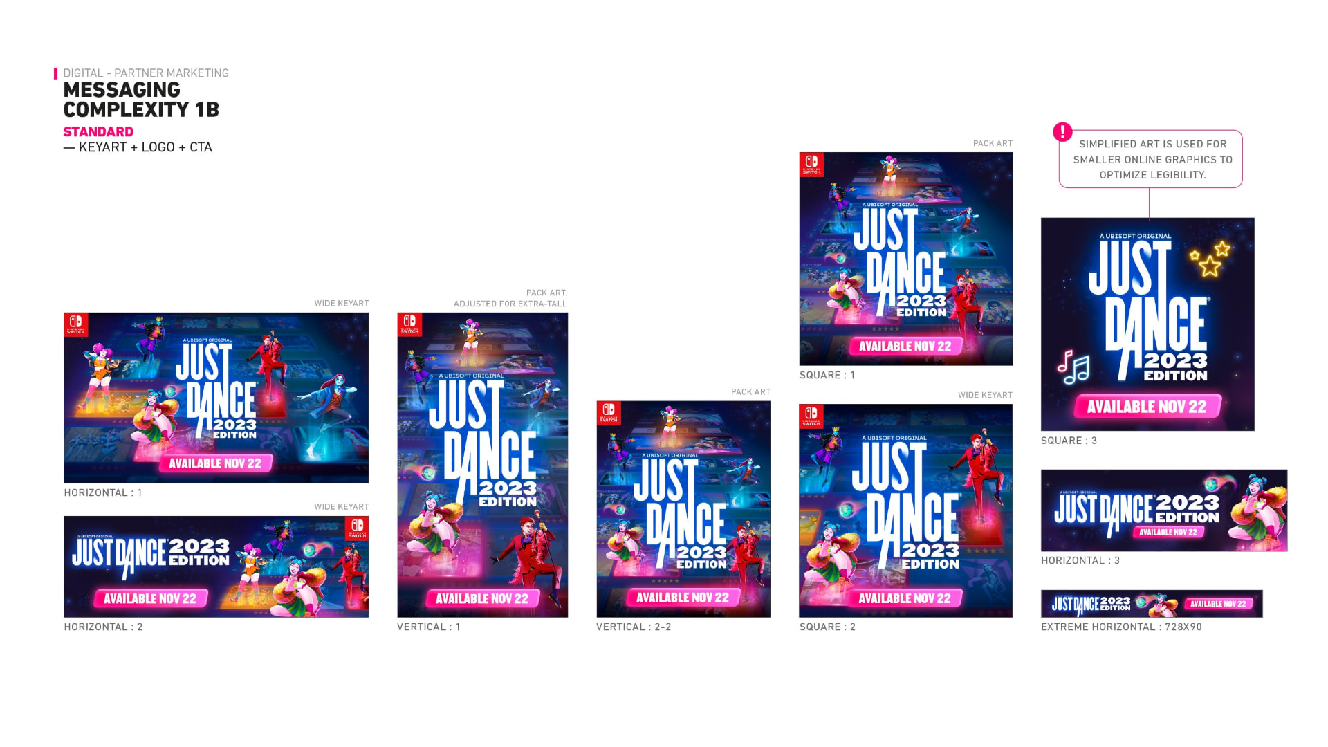
The project delivered a new franchise identity, a new key art and splash art system, evolved packaging expression, clearer character direction, and a global brand marketing toolkit for regional teams. Creative direction was informed by A/B testing, and the work launched on schedule with stronger alignment between teams.
- New Franchise Identity
- New Global Key Art System
- Evolved Packaging Expression
- Character and Coach Direction
- A/B Tested Creative Direction
- Global Marketing Toolkit
- On-Time Launch
Adaptability is part of the craft.
The experience reinforced how much communication, adaptability, systems thinking, and brand stewardship matter when a brief evolves mid-flight. Holding the through line while the details change is what keeps a global brand recognizable.
“Keep the energy. Mature the expression. The brand should feel new without ever feeling unfamiliar.”